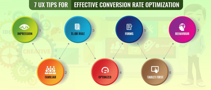
All we need is nothing but a strong conversion rate. There are “n” numbers of ways to make your pages search engine optimized, and finding the best among them would be the smartest way to get your visitors converted. Here are the best 7 UX tips for effective conversion rate, not every tip will work for everyone. Before selecting your way of getting optimization and increasing the conversion rate. Do the following four for amazing output: learn, implement, test, and debunk.
If anyone gets undesirable experience when the user visits you for the first time. He/she will decide it will not worth watching and you cannot get that customer again. So, it is much more important to attract your potential customer get the best out your page.
The web page must be catchy and every possible trick must be implemented to make your visitors scroll down by enticing them with background videos, larger-than-life image, effective animations and so on. Scrolling will make your audience engage and know more about your product/service that they are looking for. Kindly make the process easier and effective by using visual cues like pointing arrows, the top half of an image, etc. and precise content.
If you place your audience in a position that they are used to, then they can comfortably spend more time on your web page in finding what they are looking for.
Therefore, concentrate more on creating a familiar and simple design because it will not allow visitors to distract from reading your page loaded with useful information that they may look for. Anything that is familiar is more comfortable to use it.
The success of the web page lies in finding a balance between visuals and texts. Be specific and precise to get the attention of visitors. Dumping your web page with content! Stop doing it. A heap of words will not encourage your potential audience to read further. No one has time to waste time in reading the whole things.
Shorter the description, the higher the conversion rate. Brilliant usage of visuals and catchy animations stops your potential visitors at your page and makes them pay attention. Lesser content can be more specific and to the point that let the visitors understand your process easier.
The web page must not be the hub to show writing skills and language style; don’t dump too much of phrases and bombastic words to express an ordinary concept. It will undoubtedly divert the readers where the actual intention of the visitors will vanish.
Make your points clear and simple, and let it be understandable to every visitor that will help your page gets optimized. Consider this always for better results and greater conversion rate which must the end result of all our efforts.

How do you know your clients’ needs? The first thing you have to do is to understand them by engaging them in filling forms with details that you require to satisfy their business needs.
A form-filling section must be comfortable with direct and clear questions. The form does not necessarily be more attractive, interesting and catchy. At the same time, it is not good to let every visitor fill a form that will be uncomfortable for visitors. Let your potential visitors fill the form when they have reached the stage of converting it to business.
Putting the tablet first in the process of design by considering its view in a full-sized tablet and, then, extrapolate the design to make it compatible with other devices such as desktop and mobile phone.
Even though it is a new design concept, it is for sure the best practice and rocks in its performance. The conversion rate will be in rising if the design is created with the intention to fit in the devices that most of your potential customers are using.
Identifying the instant where your visitors lost interest will help you improve your page. You can find it by using Heatmaps, form analyzer, and other effective tools to discover which is obstructing your visitors from completing a conversion. With this analysis, you can identify and rectify your website’s shortcomings.
May be stupid today if you do what others won’t. But tomorrow it would lead to do what others can’t.
We're eager to work with you. Please share your project goals along with contact information. We will contact you within in 24 hours on business days. Really!